In our first year of media design, we learned the basics of visual communication and how to use Adobe Illustrator. One of the main topics was creating vector graphics – clean, scalable images made of paths instead of pixels. With Illustrator, we designed logos, icons, and illustrations while exploring color, shape, and composition. These skills form the foundation for all future design projects.
Slide 1
This poster was created for a fictional school event. The aim was to attract attention and communicate the key information clearly. I used bold typography, vibrant colors, and a balanced layout to make the poster visually appealing. It was important to combine creative design with readability so that all important details – like date, time, and location – stand out.
Slide 1
This was one of my first assignments in Media Design. The task was to create a fun and exaggerated illustration of a gym. I used bright colors and cartoonish characters to show people doing sports in a humorous and slightly chaotic way. The goal was to experiment with visual storytelling, composition, and flat design.
Slide 1
This logo was designed for the fictional zoo “Tierpark Musterhausen.” The goal was to create a modern and recognizable symbol that represents the park’s connection to animals. I chose an abstract elephant head because elephants stand for strength, memory, and peacefulness. The minimalist style and clean lines give the logo a contemporary and versatile look, suitable for digital and print use.
Slide 1
This visual identity was created for Tierpark Musterhausen. The logo features a simplified, friendly elephant head that combines modern design with a playful character. It’s flexible and works well in black & white as well as in warm orange tones.
Media Design 2nd grade
In our second year of Media Design, we focused on working with Adobe Photoshop. We learned how to edit images, create compositions, and design posters using layers, masks, and various tools. Through creative tasks, we developed a better understanding of visual communication, layout, and digital image editing. Photoshop helped us turn simple ideas into expressive visuals and professional results
Slide 1
As part of our Photoshop training, we created a personal “About Me” pinboard. The goal was to design a digital collage that visually represents our personality, interests, and hobbies.
Slide 1
In this creative task, we started with a simple image of a can. The challenge was to imagine and design something unexpected emerging from it — like animals, dreams, or fantasy worlds.
Using Photoshop techniques such as masking, compositing, and visual effects, we created surreal and imaginative scenes. This exercise helped us explore storytelling through images and strengthen our creative design skills.
Slide 1
In this creative Photoshop exercise, we started with a photo of a power pole and cables. The idea was to use the cables as visual dividers and replace each section of the sky with a different sky scene — like sunset, night, storm, or clouds.
Slide 1
My design focuses on a striking close-up of an eye, reflecting the terrifying Alien lurking within. This powerful image captures the suspense and intensity of Alien³, combined with my studio logo to mark the creative vision behind the project.
Visual arts and creative expression 2nd grade
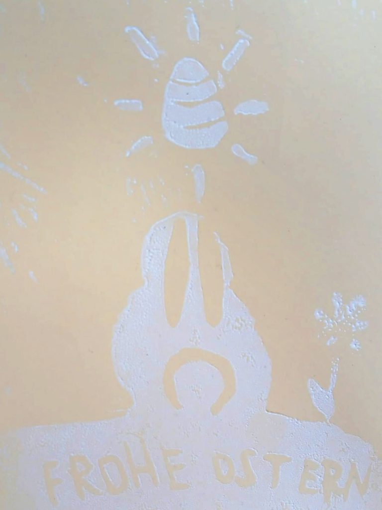
In this subject, we focused on two areas: printing and typography. First, we learned different printing techniques like linocut and stamp printing. Later, we worked with letters and type. We learned how typography can express mood and meaning.
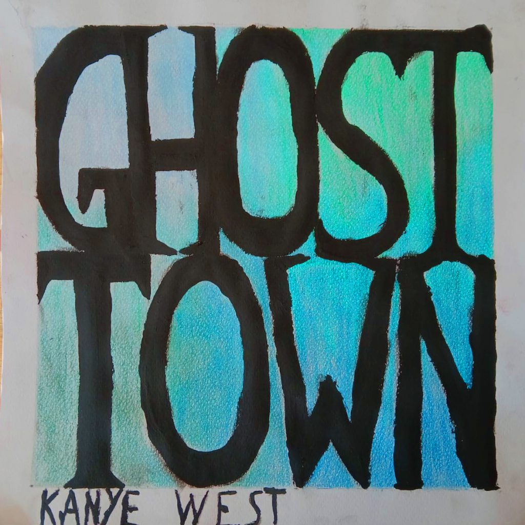
As a final project, we redesigned an album cover for a song of our choice. We used typography on purpose — to match the mood of the music and make the design more powerful.
In 2nd grade we’ve got a new subject: Photograpy, we explored the basics of digital photography. We learned how to use a camera, adjust settings like ISO, aperture, and shutter speed, and compose strong images. The focus was on understanding light, perspective, and storytelling through photos. We also edited our pictures using Adobe Photoshop and camera raw to enhance contrast, color, and sharpness. Here you can see some of the photos i’ve captured.
Slide 1
„The thing“
For this assignment, we had to photograph a single everyday object nine times from different perspectives. I chose my headphones and experimented with angles, lighting, and composition to present them in unique and creative ways. The goal was to train our eye for detail and learn how to tell a visual story using just one simple object.
2
„The thing“
3
„The thing“
4
„The thing“
5
„The thing“
6
„The thing“
7
„The thing“
Slide 1
„Own series“
For this photography assignment, I created a series of four images focusing on a car. Through editing, I gave the photos an old-school look by adjusting colors, contrast, and texture. The goal was to transform a modern subject into something that feels nostalgic and timeless.
2
Own series
3
Own series
4
Own series
Informatics 1st grade
In the first year, we learned the basics of web development using Visual Studio Code. We created simple websites with HTML and styled them using CSS. We learned how to structure content, add images and links, and design layouts with colors, fonts, and spacing. This gave us a solid foundation in front-end development.
This is the link for my website i made in 1st grade. It’s content is also about me, but in a more personal way. If i caught your attention, feel free to click the link below and have a look at my website.
In the second year, we worked with StackBlitz and the p5.js library to learn creative coding. We created visual projects using JavaScript, including random circles, numbers, and simple animations. We practiced using loops, variables, colors, and text to build interactive sketches. These projects helped us understand the basics of programming in a creative and visual way.
In this project, we used the coding platform StackBlitz and the JavaScript library p5.js. Our task was to use a loop to draw 10 colorful circles at random positions on the canvas.
We learned how loops work and how to control size, position, and color using code. It was a fun way to explore randomness and visual design through programming.
In another task, we created a simple sketch that shows a random number in the center of the screen every time the page is loaded.